
A gallery wall has the power to completely transform a space. It tells a story, adds personality, and instantly makes a room feel finished. But there’s a fine line between effortlessly curated and randomly chaotic. The good news? Creating a gallery wall that looks intentional doesn’t require an interior designer—just a little planning and confidence.
Let’s walk through how to create a gallery wall that feels balanced, personal, and beautifully put together.
Start With a Clear Vision (Before You Hammer Anything)
The most common mistake is hanging frames without a plan. Before touching the wall, decide what kind of story you want your gallery wall to tell.
Ask yourself:
- Is it modern, vintage, or eclectic?
- Do you want bold color or soft neutrals?
- Is it photo-heavy, art-focused, or a mix?
Popular gallery wall themes include:
- Family photos with a cohesive color palette
- Abstract art prints in neutral tones
- Travel-inspired photos and illustrations
- A mix of art, quotes, and personal memories
Having a clear direction helps everything feel intentional instead of accidental.
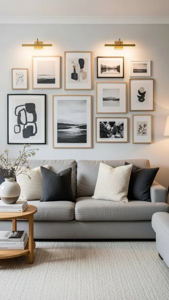
Choose a Consistent Color Palette
Your artwork doesn’t need to match—but it does need to relate.
A limited color palette instantly makes a gallery wall look curated, even when the art styles vary.
Easy palette ideas:
- Black, white, and beige
- Earth tones with soft greens
- Muted pastels
- Warm neutrals with touches of gold
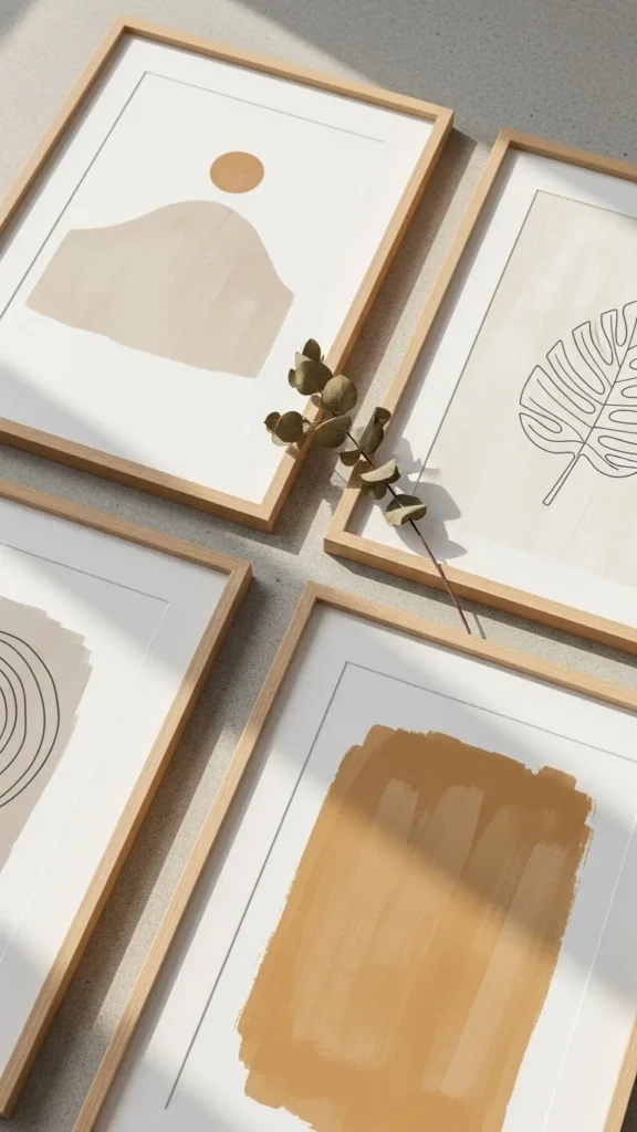
If you’re working with personal photos, try printing them in black and white or warm sepia for instant cohesion.
Mix Frame Styles (But Keep One Thing Consistent)
The magic of a gallery wall comes from contrast—but too much contrast can feel messy.
You can mix:
- Frame sizes
- Frame materials (wood, metal, acrylic)
- Artwork styles
Just keep one element consistent, such as:
- All black frames
- All white mats
- Similar frame thickness
This balance keeps the wall visually interesting while still feeling pulled together.
Lay Everything Out Before Hanging
Never hang frames straight from the stack. Instead, plan your layout first.
Try one of these methods:
- Lay all frames on the floor and experiment
- Trace frames on paper and tape them to the wall
- Use painter’s tape to map spacing
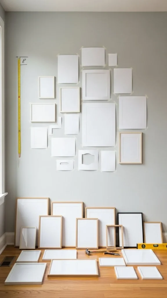
Spacing tip:
Keep 2–3 inches between frames for a clean, gallery-style look.
This step may feel tedious, but it saves you from unnecessary holes and frustration later.
Choose a Layout That Fits Your Space
There’s no single “right” layout—just the right one for your wall.
Popular gallery wall layouts:
- Grid: Clean, structured, and modern
- Salon-style: Organic, layered, and artistic
- Linear: Perfect for hallways or above furniture
- Centered anchor: One large piece with smaller frames around it
If your space is small, go vertical to draw the eye upward. For large walls, spread out horizontally to fill the space without crowding.
Anchor the Wall With One Standout Piece
A gallery wall feels more curated when it has a visual anchor.
This could be:
- A larger art print
- A bold photograph
- A unique frame or texture
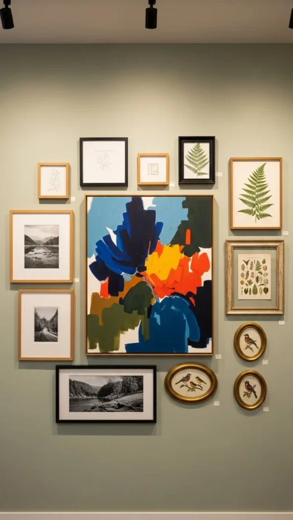
Build outward from this piece instead of randomly adding frames. It gives the eye a place to rest and ties everything together.
Add Depth With More Than Just Frames
The most artful gallery walls go beyond flat frames.
Consider mixing in:
- Small wall sculptures
- Textured art or canvas
- Floating shelves with layered frames
- Minimal mirrors
These elements add dimension and prevent the wall from feeling one-note.
Step Back and Edit
Once everything is up, step back and really look.
Ask yourself:
- Does anything feel too crowded?
- Are there awkward gaps?
- Does one piece feel out of place?
It’s okay to remove or swap pieces. Curated spaces are often edited—not overfilled.
Final Takeaway
A gallery wall that looks artfully curated isn’t about perfection—it’s about intention. With a clear vision, a cohesive palette, thoughtful spacing, and a touch of personality, your wall can feel like it belongs in a design magazine and your home.
✨ Save this guide for later and start planning your gallery wall with confidence!
Leave a Reply