
Choosing a color palette for your home can feel overwhelming. One wrong shade and suddenly the room feels off. But when the colors click? Everything feels calm, cohesive, and effortlessly stylish. The secret isn’t following trends—it’s choosing colors that truly fit your home’s style and how you want the space to feel.
Let’s break down how to choose a color palette that works beautifully with your home—not against it.
Start With Your Home’s Natural Clues
Before browsing paint swatches or Pinterest boards, look at what your home already gives you. These fixed elements are your best starting point.
Pay attention to:
- Flooring color (wood tone, tile, carpet)
- Countertops or stone finishes
- Large furniture pieces
- Amount of natural light
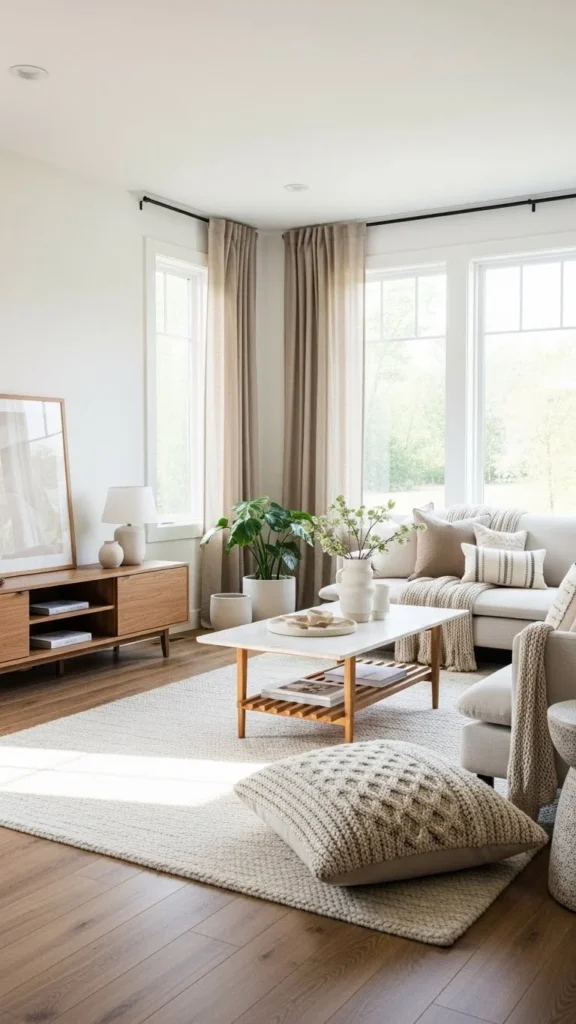
Warm wood floors pair better with warm palettes, while cool gray tiles lean toward cooler tones. Fighting these elements makes a space feel disconnected.
Quick tip:
Your color palette should support your home’s structure—not compete with it.
Identify Your Home Style First
Color works best when it matches your overall design style. If you’re unsure, think about what visuals you’re naturally drawn to.
Common home styles and matching palettes:
- Modern: Black, white, gray, beige, muted contrast
- Minimalist: Soft whites, greige, warm neutrals
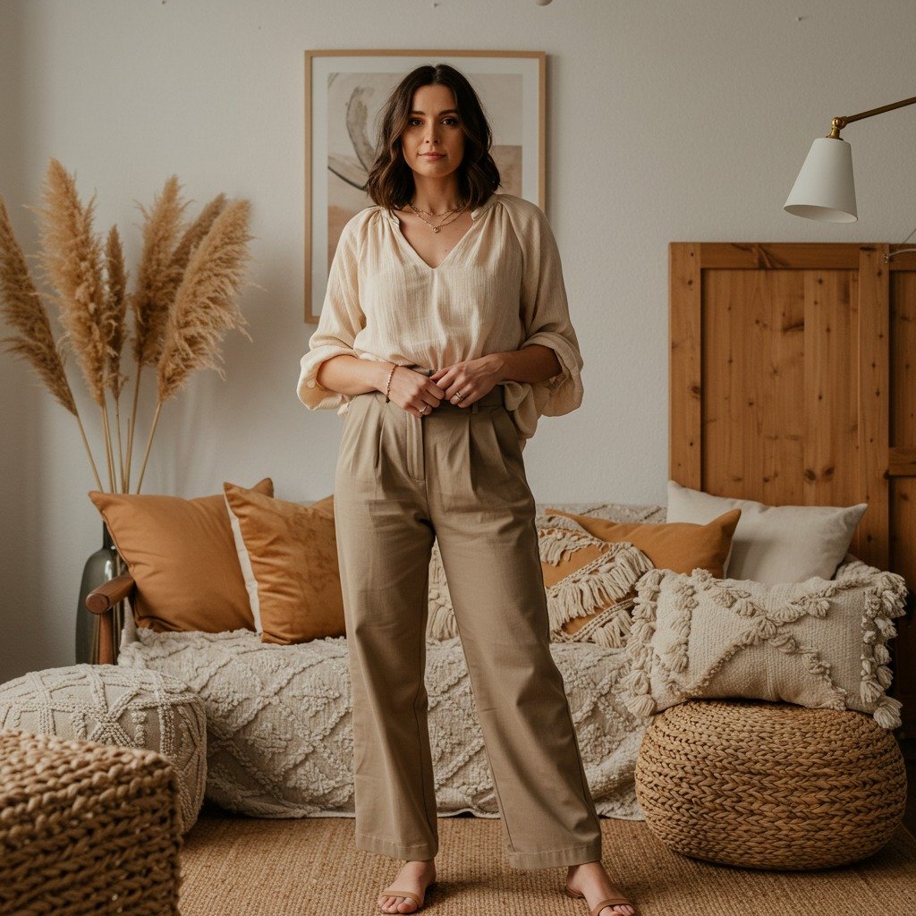
- Boho: Earth tones, terracotta, sage, warm creams
- Traditional: Navy, taupe, soft blues, classic neutrals
- Scandinavian: Light gray, white, pale wood, soft pastels
Once your style is clear, color decisions become much easier.
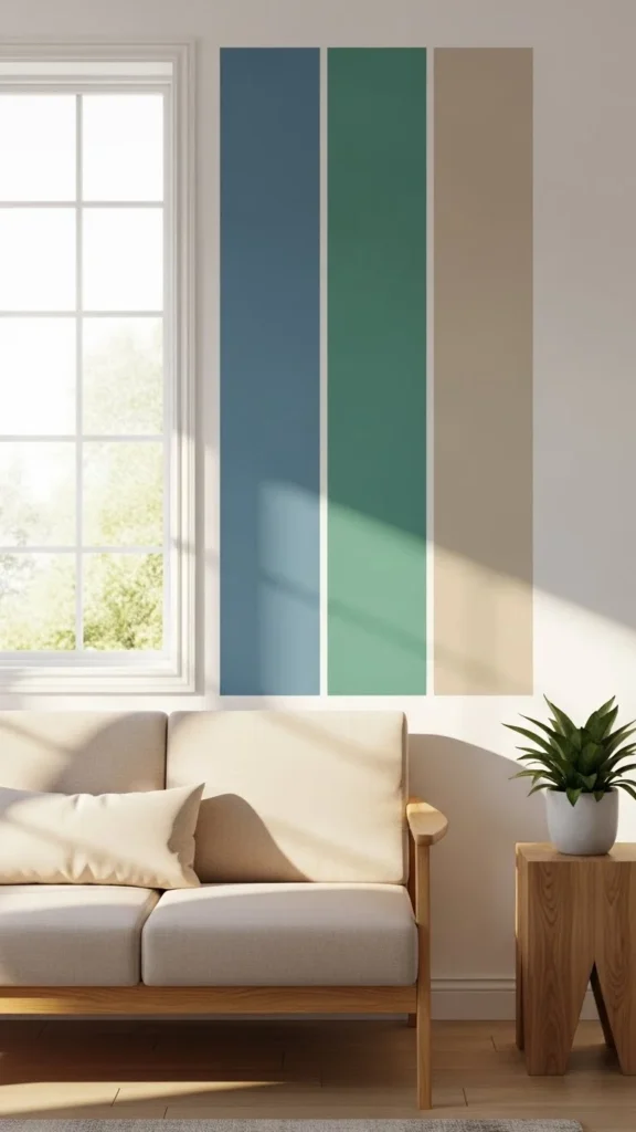
Use the 60–30–10 Color Rule
This designer-approved rule creates instant balance.
- 60% – Dominant color: Walls or large areas
- 30% – Secondary color: Furniture, curtains, rugs
- 10% – Accent color: Decor, pillows, art
For example:
- 60% warm white
- 30% soft beige or gray
- 10% black, brass, or muted green
This prevents the space from feeling flat or overwhelming while still adding personality.
Decide the Mood You Want to Create
Colors don’t just look good—they feel a certain way. Before choosing shades, ask how you want the room to feel.
Mood-based color ideas:
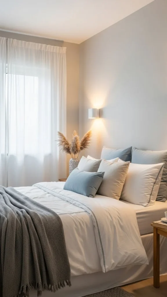
- Calm & relaxing → Soft neutrals, muted blues, sage green
- Warm & cozy → Cream, taupe, caramel, warm browns
- Fresh & airy → White, light gray, pale pastels
- Bold & dramatic → Deep navy, charcoal, emerald
If a room feels too cold or too busy, the palette is usually the reason.
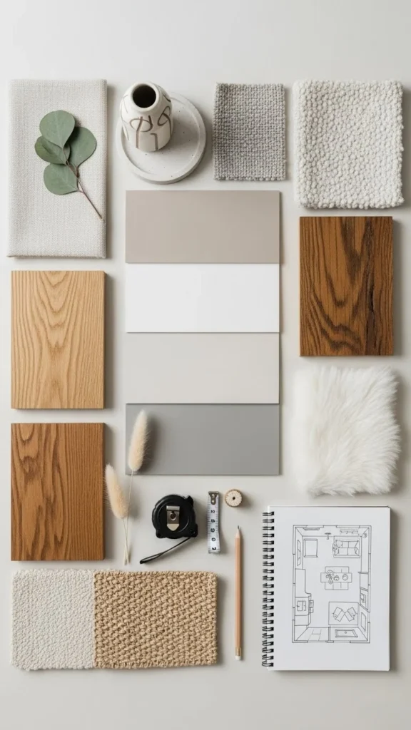
Pull Colors From One Anchor Piece
If color selection feels intimidating, let one item do the work for you.
Great anchor pieces include:
- A patterned rug
- Artwork
- Throw pillows
- Curtains
Pick 2–3 colors from that item and build your palette around them. This creates a natural, cohesive look without guesswork.
Test Colors in Real Lighting
A color that looks perfect online can look completely different in your home.
Before committing:
- Paint sample patches on multiple walls
- Observe the color morning, afternoon, and night
- Test next to furniture and flooring
Lighting changes everything—always test before deciding.
Keep It Flexible and Layer-Friendly
The best color palettes aren’t rigid. They allow you to change decor without repainting every year.
Flexible palette tips:
- Use neutral walls as a base
- Add trends through pillows, art, and throws
- Stick to 3–5 main colors per space
This makes seasonal updates easy and budget-friendly.
Trust Simplicity Over Trends
Trends come and go, but timeless palettes last.
If you’re torn between trendy and classic:
- Choose classic for large surfaces (walls, floors)
- Use trends in small, changeable accents
This keeps your home feeling fresh without regret later.
Final Takeaway
Choosing a color palette isn’t about rules—it’s about understanding your space, your style, and the mood you want to live in. Start with what your home already offers, build slowly, and trust your instincts.
🎨 Save this guide for later and use it whenever you’re refreshing a room or planning a new space!
Leave a Reply