
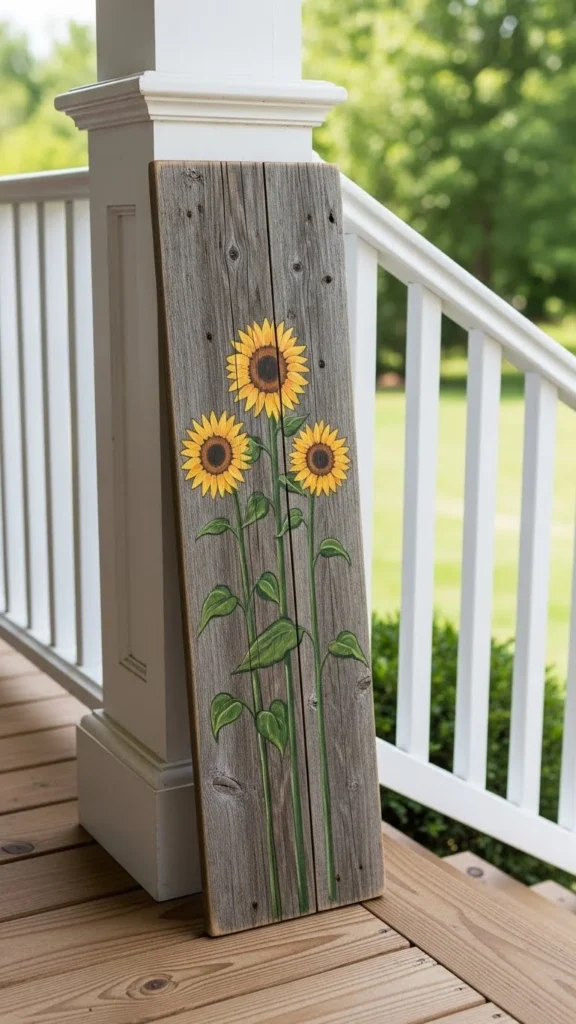
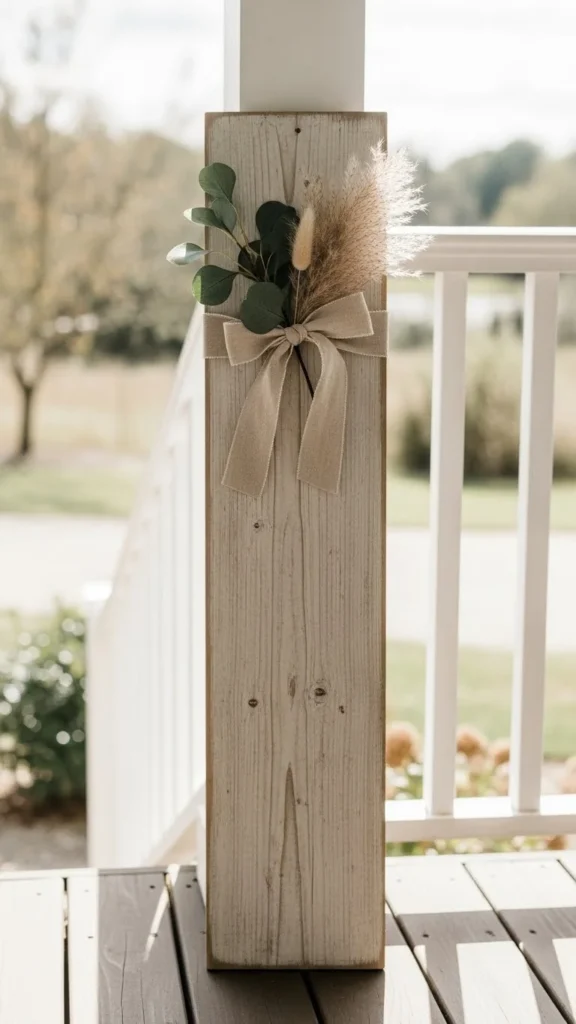
A porch sign often sets the tone before anyone rings the bell. Neighbors notice it during walks, deliveries pause near it, and guests form first impressions in seconds. The right style can make a porch feel warm, thoughtful, and lived-in without heavy spending. This list focuses on realistic porch sign ideas that work for everyday homes. Each option is easy to find, simple to make, or friendly for small budgets. You’ll see how color, scale, and placement matter more than price, and how small tweaks can make a porch feel put together fast.
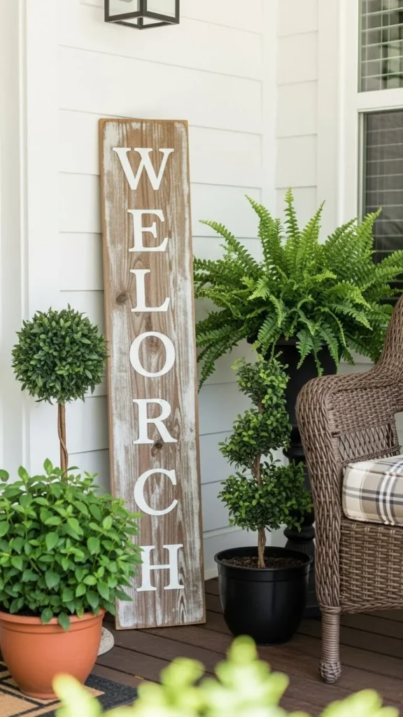
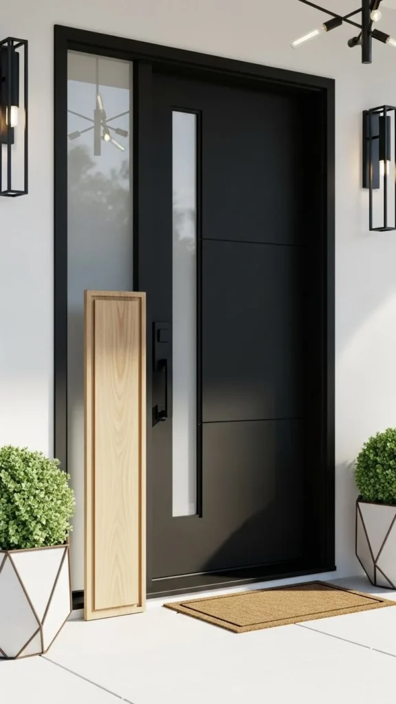
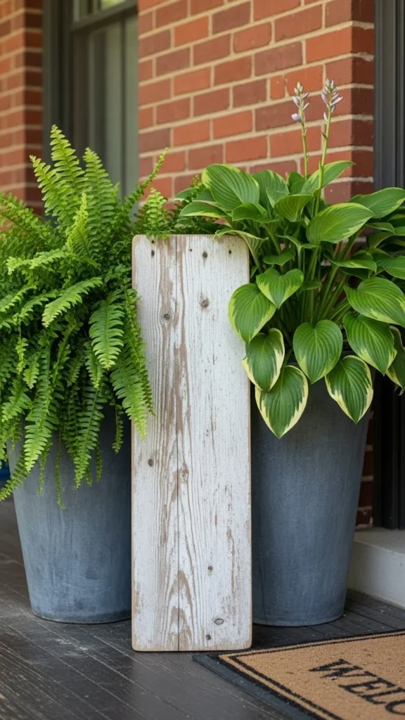
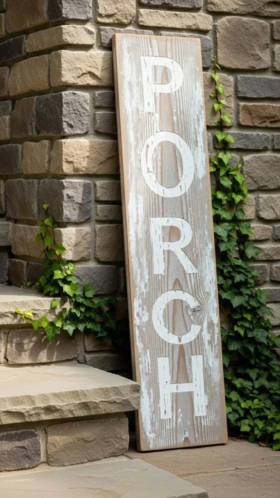
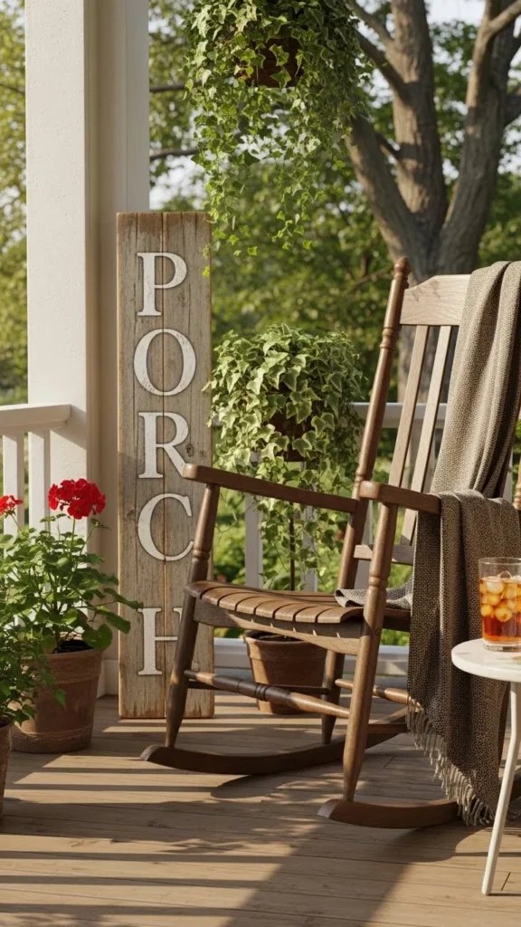
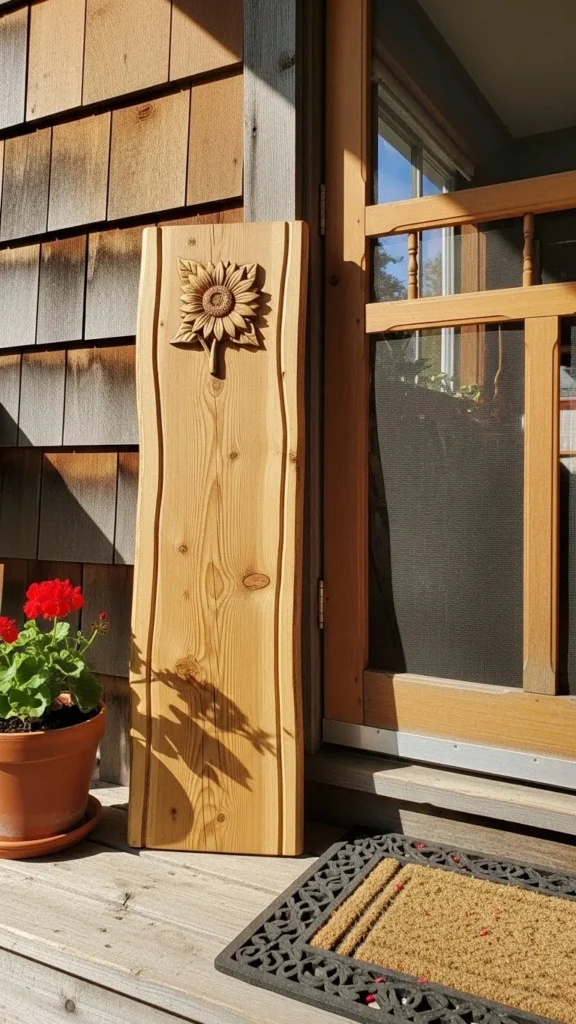
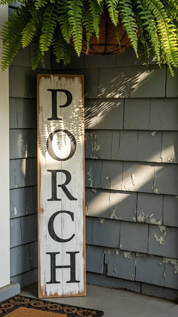
Classic Vertical Wood Board
A tall vertical board feels familiar and calm. It works because the shape mirrors door frames and porch posts. You don’t need custom work. Fence boards or leftover lumber can do the job. Sand lightly and keep the wood raw for a relaxed look.
Place it near the door rather than the edge. That keeps it from feeling forgotten.
Budget tip: buy a single untreated board from a hardware store.
DIY idea: lightly whitewash with watered-down paint and wipe it back. The grain still shows, and mistakes disappear easily.
This style pairs well with lanterns or a small stool. Keep spacing loose so the porch doesn’t feel crowded. Even on small porches, a vertical board adds height without taking floor space.
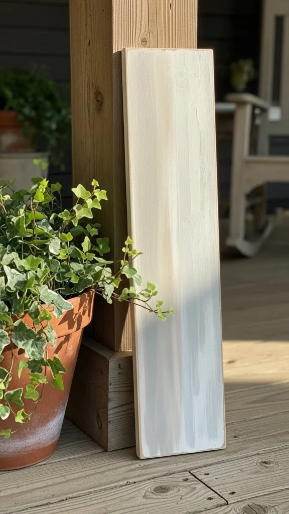
Soft Neutral Painted Sign
Neutral paint tones feel calm and tidy. Think warm white, sand, or pale gray. These shades work across seasons, so you don’t feel pressure to swap decor often.
Paint doesn’t have to look perfect. Slight brush marks add charm.
Budget tip: sample-size paint jars are enough for one sign.
DIY idea: paint only the front and let the edges stay raw. That contrast keeps it from looking flat.
Place it near planters or baskets to soften the edges. This style suits modern and traditional homes equally well.
Weathered Farmhouse Look
A slightly worn surface feels relaxed and familiar. You can fake age without heavy tools.
Sand corners more than the center. That’s where wear happens naturally.
Budget tip: thrifted signs or old cabinet doors often work.
DIY idea: rub candle wax on edges before painting, then sand lightly. Paint lifts easily in those spots.
This style pairs well with galvanized buckets or old crates. Keep nearby decor simple so the texture stands out on its own.
Slim Minimal Board
A slim sign fits small porches. It feels neat rather than bulky.
Choose straight grain wood for a cleaner look.
Budget tip: cut a wider board in half at the store. Many shops do this free.
DIY idea: seal with clear matte finish only. No paint required.
Lean it close to the door frame so it feels intentional, not random. This option works well when the porch already has color from plants or furniture.
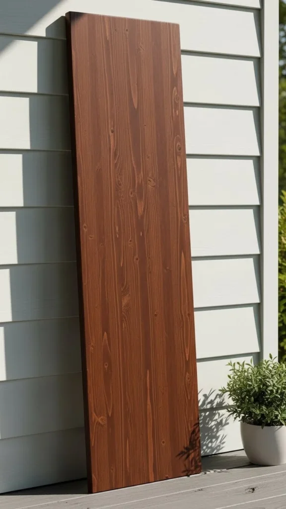
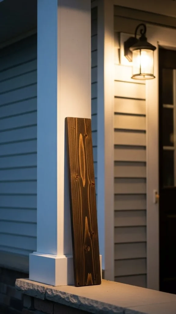
Dark Stained Wood Contrast
Dark stain adds weight and balance. It stands out against light siding.
Stain is forgiving. Uneven spots add depth rather than flaws.
Budget tip: small stain cans go far on one board.
DIY idea: wipe stain on with an old cloth instead of a brush. It spreads evenly and dries faster.
Use this style when the porch feels washed out. It grounds the space visually.
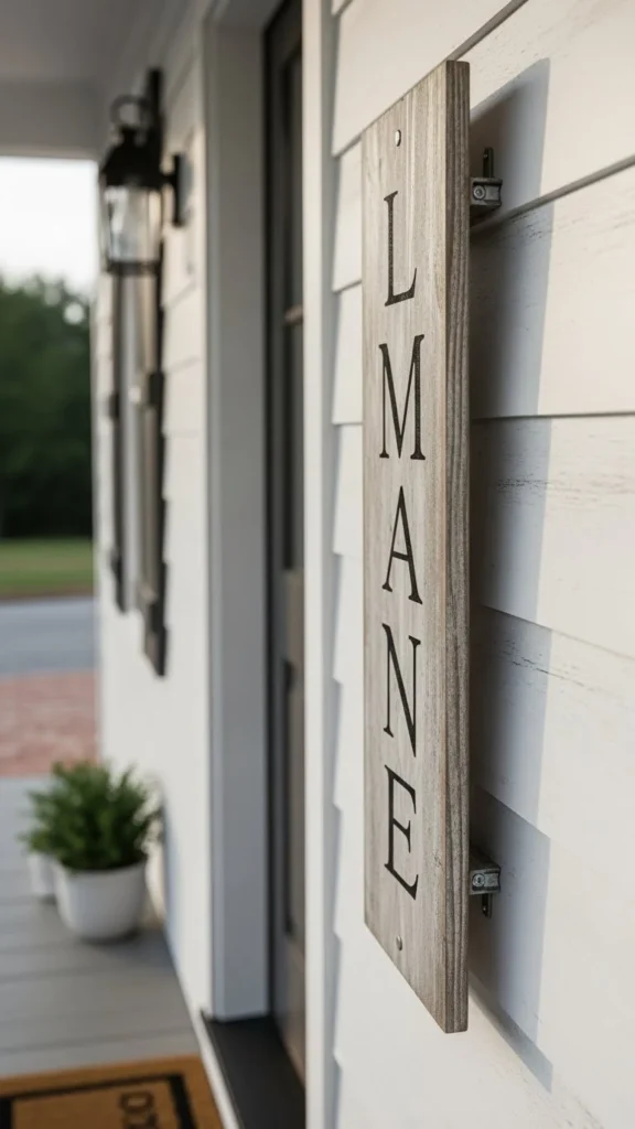
Lightly Mounted Leaning Sign
A sign doesn’t always have to sit on the floor.
Use small L-brackets to keep it upright without full mounting.
Budget tip: basic brackets cost little and install fast.
DIY idea: leave a small gap between sign and wall. That shadow adds depth.
This approach helps in windy areas and keeps walkways clear.
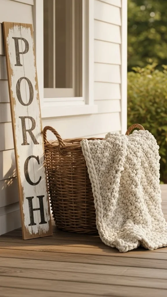
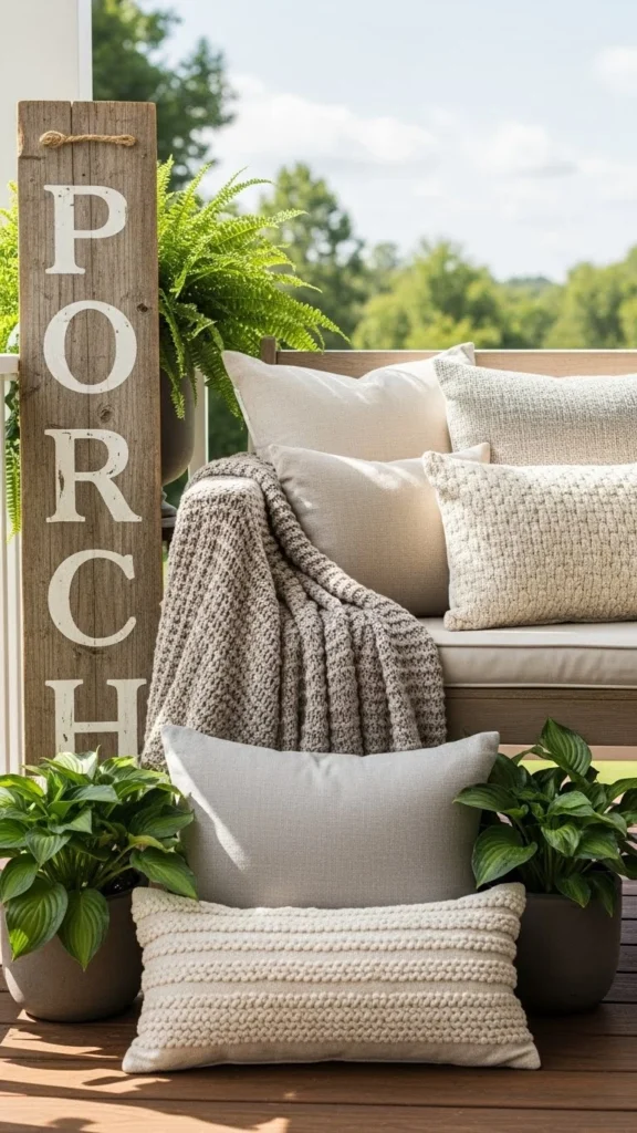
Basket-Paired Porch Sign
Pairing adds warmth. A simple basket beside the sign makes it feel styled.
Fill the basket with rolled blankets or faux greenery.
Budget tip: thrift stores often have sturdy baskets.
DIY idea: tie a neutral ribbon around the basket handle for a subtle touch.
This setup works well near seating areas.
Plant-Framed Statement
Plants make any sign feel intentional.
Tall planters on both sides create balance without symmetry stress.
Budget tip: use inexpensive plastic pots and place them inside baskets.
DIY idea: choose one tall and one medium plant for a relaxed look.
This works best when the sign stays simple so the greenery does the visual work.
Corner Tucked Sign
Corners often go unused. A sign fits perfectly there.
Angle it slightly instead of pressing flat.
Budget tip: no extra decor needed when the placement feels thoughtful.
DIY idea: add felt pads under the base to protect flooring.
This approach suits compact porches.
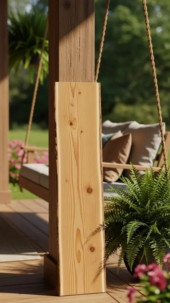
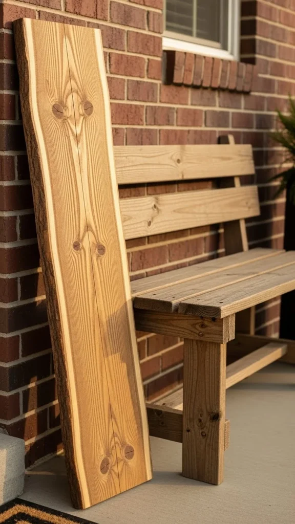
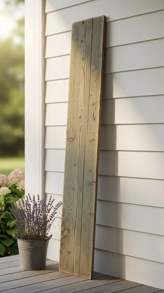
Clear-Sealed Natural Grain
Natural grain feels honest and calm.
Clear sealant protects without changing color.
Budget tip: water-based sealers dry fast and clean up easily.
DIY idea: apply two thin coats instead of one thick one.
This style works year-round without updates.
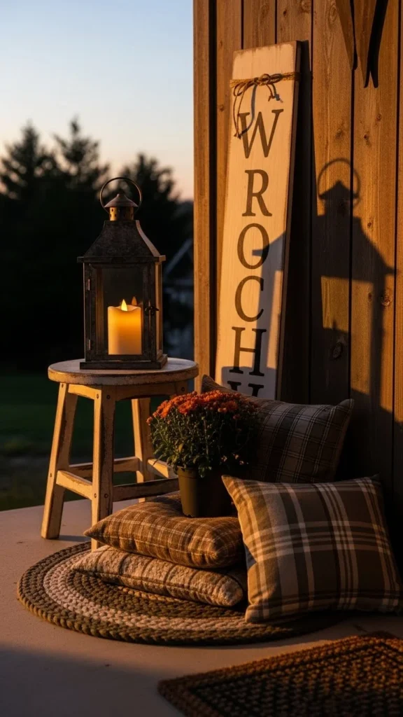
Layered Height Setup
Different heights keep the porch from feeling flat.
Place the sign behind a low stool or lantern.
Budget tip: use items you already own.
DIY idea: stack books or a crate under smaller decor for height.
This setup feels collected rather than staged.
Modern Porch Pairing
Modern porches benefit from simple signs.
Stick to straight edges and smooth finishes.
Budget tip: MDF boards can work if sealed well.
DIY idea: sand edges crisp rather than rounded.
Let nearby decor stay minimal so the sign feels intentional.
Stone-Side Placement
Signs near stone or brick gain texture contrast.
Keep the sign finish simple so materials don’t clash.
Budget tip: no extra styling needed.
DIY idea: adjust angle until it feels relaxed, not stiff.
This placement works well near steps.
Seasonal Swap Base
Use one sign year-round. Change only nearby decor.
That saves storage space and money.
Budget tip: neutral signs work across seasons.
DIY idea: hook small decor onto removable adhesive hooks on the sign sides.
This keeps the base setup consistent.
Seating Companion Sign
Signs look natural near seating.
Lean it beside a chair or bench.
Budget tip: no extra decor required.
DIY idea: keep the sign height close to chair back height.
This creates balance without effort.
Soft Edge Hand-Cut Style
Perfect edges aren’t required. Slight curves feel handmade.
Cut slowly and sand gently.
Budget tip: hand tools work fine for soft curves.
DIY idea: sketch the curve lightly before cutting.
This style feels relaxed and personal.
Earth-Tone Painted Board
Earth tones feel grounded. Think clay, sage, or warm taupe.
These shades pair well with plants and stone.
Budget tip: mix leftover paints to create custom tones.
DIY idea: test color on the back first.
This option feels calm and steady.
Siding-Matched Sign
Matching siding texture keeps things cohesive.
Use similar board widths or finishes.
Budget tip: leftover siding pieces can become signs.
DIY idea: keep color slightly lighter for contrast.
This feels intentional without drawing too much attention.
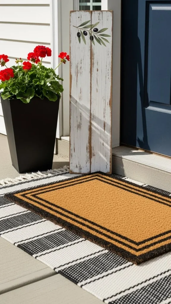
Entry Mat Pairing
Pairing a sign with a mat anchors the entry.
Keep spacing loose so nothing feels cramped.
Budget tip: reuse an existing mat.
DIY idea: shift items slightly until the flow feels natural.
This works well for narrow porches.
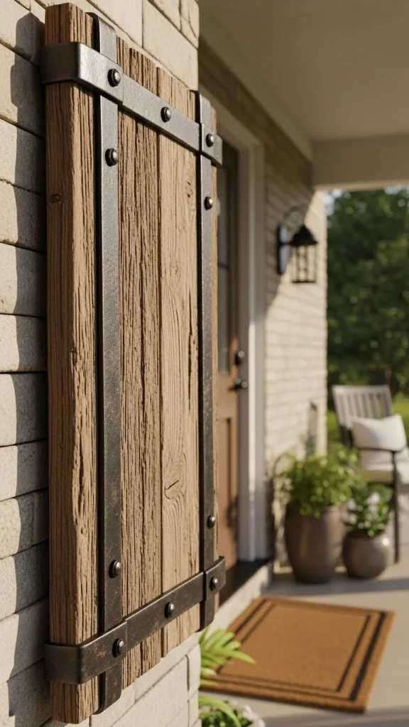
Wood and Metal Mix
Metal adds contrast without overpowering.
Use simple brackets or straps.
Budget tip: basic hardware works fine.
DIY idea: darken metal slightly with spray paint.
This suits rustic or industrial homes.
Casual Lean Placement
Not everything must be straight.
A relaxed lean feels lived-in.
Budget tip: no hardware required.
DIY idea: adjust angle until it feels natural.
This suits informal porches.
Small Table Companion
A side table adds balance.
Place the sign just behind it.
Budget tip: thrifted tables work well.
DIY idea: keep tabletop decor minimal.
This setup feels cozy without clutter.
Rounded Corner Board
Rounded corners soften the look.
They also reduce chips over time.
Budget tip: sand corners gradually.
DIY idea: trace a small bowl to guide curves.
This feels gentle and approachable.
Shaded Porch Accent
Shaded porches suit lighter signs.
They catch available light better.
Budget tip: lighter finishes require less prep.
DIY idea: seal well to prevent moisture issues.
This keeps the sign visible without glare.
Textile-Styled Setup
Textiles soften hard surfaces.
Place pillows or throws nearby.
Budget tip: use outdoor-safe fabrics only.
DIY idea: stick to one color family.
This setup feels welcoming.
Porch Post Lean
Posts offer natural support.
Lean the sign slightly against one.
Budget tip: no extra decor needed.
DIY idea: adjust height so it aligns with post lines.
This feels clean and balanced.
Everyday Neutral Sign
A neutral sign works daily.
It doesn’t demand attention yet feels thoughtful.
Budget tip: one sign replaces multiple seasonal pieces.
DIY idea: keep finish simple and matte.
This option suits busy households.
Conclusion
Porch signs don’t require big spending or complex plans. The ideas above show how placement, finish, and pairing matter more than size or cost. With one board and a few simple touches, a porch can feel intentional and welcoming. Pick a style that fits your space, work with what you already have, and adjust slowly. Small changes often make the biggest difference when neighbors walk by.

Leave a Reply